Monday, January 31, 2011

Social Networking in the United Arab Emirates


The United Arab Emirates (UAE) is a federation of seven emirates; Abu Dhabi, Dubai, Sharjah, Ajman, Umm al-Qaiwain, Ras al-Khaimah and Fujairah. The United Arab Emirates (UAE) occupies an area of 83,600 sq km along the south-eastern tip of the Arabian Peninsula. Since their creation in 1971 they have quickly grown into one of the richest countrys and has one of the fastest growing tourist destinations.  Most of the 6 million people that populate the UAE practice islam (96%) ; however, other realigions are allowed and widely excepted (4%). Of the total 6 million residents, less than 20% are Emirati, more than half are South Asian, and a significant number are from Europe and North Africa.  The majority of U.A.E. citizens are Sunni Muslim with a Shi'a minority. Many foreigners are Muslim; Hindus and Christians make up a portion of the U.A.E.'s foreign population.


The UAE has about 3.449 million internet users and rank 61st in the world as far as internet usage.  The UAE has similar social networking as the USA, they have a website  called UAE-Friendster and workes realitivly the same as facebook.  Most television and radio stations remain government-owned; widespread use of satellite dishes provides access to pan-Arab and other international broadcasts.  Since the country is a big tourist hotspot most of the social media is similar to other major countrys around the world.

Artificial peninsula and islands that make up Palm Jumeirah in Dubai.


Sources:
https://www.cia.gov/library/publications/the-world-factbook/geos/ae.html
http://www.emirates.org/about.html
http://www.uaefriendster.com/
http://www.state.gov/r/pa/ei/bgn/5444.htm

Sunday, January 30, 2011

Blog Post- 10 Principles of Design

[Space]

I define space as somewhere that makes a particular environment or feeling.The space created outside of the Cafeteria around the fountain creates a environment of relaxation and the trees that overhang the space close it in creating a intimate place to bond with friends or do homework. This space shows how levels of steps create a room like feeling dividing up the space.

[Power]

The Library Towers demand a sense of power since they are roughly the center of campus and are taller than any building around it. With the word power i tend to think about knowledge and since this building hold thousands of resources for the student body that shows that knowledge is power and since the university as a whole provides us with that the university also holds power over the surrounding area.

[Experience]

On Campus the most valuable thing besides learning is having a college experience and this experience rotates around the more social side of campus. The Elliott University Center as well as the quad serve as a place for the student body to interact and bond.  This experience is influenced by the openness of the quad and how is seams to by surrounded by structures making a safe feeling for the people who interact there.

[Principles]

UNCG has the highest regards for principles and for making education come before any other activity so it only makes sense to locate the schools faculty center before all the social parts of campus when your walking down college avenue.  In class we also learned how a circle represents a sacred spot and since one lays at the entrance to the Faculty center the principle of school being the most important thing on campus is stressed.

[Precedent]

Since the campus is designed for learning as well as living one must take precedent over the other this is why our campus is designed the way it is.  If you look at a campus map you will notice three different areas represented, one being all the buildings dedicated to education, then those that serve to nurture us such as the Elliott University Center the Jackson Library and the Cafeteria all nurture us in different ways physically or intellectually.  The last being dorms for all those who live on campus.  These three parts of campus make up a working system which allows us to be active participants in our education.
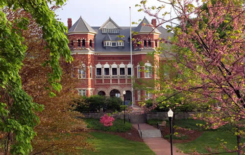
[Site]

The site of the Foust Building is a location that draws attention to the building itself. It is located on a hill framed by large oak trees that create a frame for the building and create a feeling of grandeur. The design of the building reflects the site by having two linear structures that draw the eye upward and exaggerate the height of the building and its location.

[Order]

Campus shows order through having different departments for majors and having different buildings for each subject.  Also by ranking students in different orders such as under-graduated and graduates, freshman or sophomores.  All the rankings combine to create one large group labeled at UNCG students which falls under the larger order of NC college students and then American college students and so on and so forth.

[Scale]

This building demonstrates different scales by all the different levels and different depths which adds a unique visual effect. Not only does the campus reflect scale in the buildings but it also reflects a smaller scale of the surrounding city of Greensboro. The campus had food sources and housing sources.

[Technology]
This is reflected everywhere on campus from the spartan cards we swipe to pay for meals to blackboard where class information is posted. In today's society there is no part of our lives that hasn't been influenced by technology.  In classes we now are allowed to take notes on our laptops and required to keep a online record of our work this all combined influences how we learn an communicate with others.  UNCG has arrived in the 21st century where everything is through the computer and that helps to relate to present day students.

[Surface]


Surface is shown all over campus by the brick path ways, the stone columns on the buildings and in most recent buildings the concrete and exposed steal beams.  The change is surfaces used in design is very vivid at UNCG just looking at the Gatewood Studio Building compared to the Foust building across the street.  Some surfaces are still the same like the brick but as shown looking at these two buildings they are very different designs. We can assume that the surfaces are similar but give off different feelings and design styles both reflective of styles of Architecture.


source's for all the photographs used in this blog post:
http://provost.uncg.edu/Academic/OSM/bldg_dir.asp

Reading Response #3 Mayan Civilazation

  
Sources: A Global History of Architecture by Ching
http://www.adishakti.org/mayan_end_times_prophecy_12-21-2012.htm

Wednesday, January 26, 2011

Light Box


For this project we were ask to build a 12 x 12 x 18 box and make cuts in the box to create four diffrent spaces defined by light.  When i began thinking about space i started to think about how i expirence it and how it effects me from day to day. I came to discover that i relate better to a space when the space makes me feel confrontable and at home.  


So I then decided that i was going to create intaminte space useing texture and direct light and indirect light.  The scale of the zig zags are roughly a inch apart and decrease the space creating a division between the rest of the box. 


Then in class after we all talked about our projects a overall theme in the discussion was how we use the bristol board and the scewres to inhance our light effect and compliment the light.  I decided to add this sail like paper to catch the light  ans bend it creatind a shadow benieth the sail.


After looking at the one sail i started to play around with adding multiple layers at diffrent levels and still keeping with the fourness.  when i added the secont sail the zigzzags suddenly looked out of place and didnt activly effect my idea any more so i decided to rebuild my box removing the circle and the zig zags and incorporated the second sail closer to the top of the box.
The way the light hit the sails the light hit the top sail then hit the bottom sail creating a definate border betweent the spaces created. To show the scale of the box and our design we had to create a scale figure to give the box more context and i chose to make mine small to make the box apear like a large inclosed area.

Saturday, January 22, 2011

Rituals & Enviroments

There are elements in design that are reflected everywhere in our world today, but these ideas originated with past societys. The ideas of circles, groups, and stacks are some of these concepts and through these ideas we learn that in past cultures the enviroment around them inspired their culture and rituals but their rituals also inspired their enviroments. This idea of enviroments influencing rituals and rituals influencing enviroments is key to understanding design and on the UNC Greensboro campus this is reflected. My personal option is that rituals influence our enviroments just like in a kitchen you dont have a couch in the middle of it because you dont use that room in that way so you have a sink and dishwasher and cabinits therefor ritual influences our enviroment.


CIRCLES: repersentation of the sun and the moon, also signifies a sacred spot at the center.  On campus this is shown by the entry way into the EUC building and how when you walk in at the base of the staircase their is a circle layed in tile and the staircase is circular marking a sacred spot at the entrance of the building.


On college Avanue there is a circle layed in brick at the middle point of campus marking the central point to all activites. while walking down college ave. you can see many more circles layed in the walkway all of which mark where another path crosses the walkway.  These circles embeded in our universitys design show our relationship to the sun and moon but more importantly to sacred spots around campus.


 GROUPS: repersents groves of trees, reaching vertically, and groups of people.  Collums are a great example of groups trees because of their verticality and because of their spacing on buildings.  Collums create this sence of entry into a space and create a frontpoarch of sorts which adds importance to a building.


Also plants are grouped when planted to add visual intrest to the landscaping and the arches behind the bushes inforce this virtacal nature of the archatecture.  The arches are repetive and adds contrast to the enviroment also they create a sence of balence and harmony by being symmetrical to one another.


STACKS: Repersentative of mountians and gathering resources.  Stacks are shown thrugh the stacking of bricks on buildings around campus as well as the horizontal slats in the shutters all creating emphasis on the design elements they surround.


Stacks around the entrance to the EUC helps show the grandger of the entrance and adds balence to the largness of the entrance.  These stacks relate more to the circular shape of the entrance rather than just the verticality and emphasis the circles meaning of a sacred spot benieth it.


[PEOPLE] : forms that emulate the human body.  I believe the two collume like structures at the end of college aveanue are like gards the cap stone signifying the head of the gaurds and the shaft being the body and the base stone representing the feet of the human body.  These two elements are often overlooked but if you look down college ave. from the education building facing the path you notice these two stone collums mark the entrancea and aligned with them is light poles all the way down the path creating a boundry for the path and showing harmony and balence as well as porportion.


Monday, January 17, 2011

Friday, January 14, 2011

My New Header


For Design Visualizations we were ask to create a new blog header that described our inividual design style.  At first i had no clue what my design style even was but the more i thought about it i realized that i LOVE to mix natural elements with clean lines materials and juxtapose the two materials to show the beauty of each.  In my header the main type facce is organic in nature with curved lines and a thicker line weight to show the nature aspect of my designs.  Also the second type face is ccreated with cleanre lines and is simple.  I chose to include two diffrent type faces because it created a order and higharchy of infomation for my header.  The simple image in the background is composed of a light blue, light green and a nude which balances out all the infomation going on with the header.   I chose to keep the lines irregular and unplanned in order to show the importance of flow in my designs.  This exercise has helped me to figure out my personal design style and showed me how to explain that thru a header.