Wednesday, December 8, 2010

3rd Year Final Presentaions

We were ask to attend third year final presentaions on monday and they have been focusing on the idea that all thing eventuallly come back around to where you start. They showed us two project they have been working on.

 The first was taking a old delapadated building in durham on West Parish St. and transforming it into a split use facility a wine bar and wine retail store and the top two levels as apartments.  Many groups decided to make the loft spaces a place for cuples who were ready to start there life and this made the design more focused.

My favorite presentation was The Buddest Peacock.
The idea behind this design was that the peacock tends to eat really harmful things that would kill any other animal but instead the peacock grows stronger and more beautiful with every bite.  The buddest people think of the peacock as a boddhisttia who is a creature that takes hard paths towards liberation and thru eating the plants the peacock signifies this idea.  This realted to the building because the building had once been a crack house and a brathel and from that poisen was going to rise a strong design and a strong building.


These are two pictures of what the upstairs lofts will look like and they were inspired by the colores of the peacocks tail bothe bright but also relaxing and conforting.  This groups project showed my how a idea can translate into a overall design plan and i was very impressed by the groups research into the buddhist culture and beliefs in order to make there inspiration translate into their design.


The second design persentation was to design the Central Reigional Hospital Child and Adolescent  PCU.


One presentation focused on the ecosystem as her inspiration for the project and the three parts the sky, the land, and the water. The female unit was the sky and the crane which symbolized wisdom and is a token of hope and healing in challenging times. The male unit was the land and the elephant which represents strength and honor and posseses the ability to deal with obsticles he is face with. The childrens unit and the koi fish whish stands for courage and endurance and it is the only fish that swims against the current of the stream and up waterfalls. The designer ment for the koi fish to stand as a metaphore that will show the children they font have to follow the flow of everyone else and helps them to have the strength to make it through anything. These three concepts grounded the idea behind the units and allowed the designer to create a colorful enviroment.


Through the space the design inspiration translated but creating spaces that made the children feel at home and safe because the suroundings were things they had seen before. This presentation by Kalani Gonzalez inspired me to think about more involven inspieations and how research on my inspirations can better inspire my future projects rather than having one base inspiration and just staying with that concept i will now research my inspiration better so it can help me come up with well rounded ideas with a better background in what i was acually inspired by.

Thoughts While In Final Critiques

While i was sitting in the critiques monday i was thinking about my project and how much i liked how it turned out then i started to imagine my project as a collum in a building. This reminded me of the inside upside down forest in Cozamel Mexico.
This is what i would love to do with my project, remake it so it is floor to cealing height and use it in a corner of a room at a design statement as well as a lighting fixture. I hope some time in the future i will be able to expirement with useing things from nature as they are in a room and adapting them to serve a purpose rather than just decoration.

Tuesday, December 7, 2010

Luminear Project Board


During our luminear project we were ask to take a piece of dark canson paper and create a plan, section, elevationa view of our light project and a visual reprentation of our light effect. This was hard to do because i am normally use to drawing on light paper and creating the shadow were we had to create the light.  Throuhout the process we were instructed to use high levels of contrast to make our boards look better and that is why my second version is only useing white and black pencils to create the light. after i had a idea of my layout i started to organize my board and draw all my images on the paper.  I chose to make the 3 views of my project smaller and overlap them with my light effect to create a diffrent type of layout instead of the mormal ideas of presentation boards.
On My final board i tried to make the tree stump itself fade into the background and the light shine throuh all my drawings since that was the focus of the project and after all my drawings were done i added a title to fill the space in the upper left corner of the project.  In the end i created a layout that showed my project off and demonstrated my light effect to the best of my ability. 

In-Class Shading & Personal Best


In class on December 2nd we were ask to focus on shading the folds and creases in the sheets that were draped over two chairs.  While i was drawing the folds i used a variety of pencial lead weights to achieve diffrent depts and shadows created by the fabric and the fabric came to life as i was drawing it. I am very satisfied with the drawings because i believe it is one of my personal best that i have drawin in my drafting class this year.  I have learned over the semester that to create life like detail you must use diffrent line weights and qualitys in both observational drawings and is draftings. Both require a attention to detail that i did not realize at first but through many classes i learned techniques thati have put into use and have improved greatly in my abilty of drawing both.


Best Drawings

In class we were split up into groups and told to draw what we saw i decided to focus first on the outside shape then fill in the rest after the shape was in. Normally i do both as i draw but this time i really was trying to draw how i had been told and instrusted all semester.  I tryed to capture the overall emotion of my drawing but i am not compleatly sure if i did so but this excercise helped me to understand why shading and the concentration to detail is so important.  After the class finished we were ask to pin up our drawings and then told we had to pick one to take down and we had to have a reason. This was nerve racking to me since i thought all the drawings were better than mine and figured mine would be one of the first taken down, however mine stayed up for a little bit and the reason it was taken down was because i needed to add more detail to them because the rest that were up looked very realistic and mine did not.  This exercise helped me to realize that i always need to be proud of my work even if its not the best of the group and i always need to do my personal best even if my best is not the best out of the class.

Saturday, December 4, 2010

Luminear Project


For our final Studio project we were assigned to take a picture of a light effect and create a laminar to portray this effect.  My light effect was a picture of light filtered through clouds and i knew off the bat i didn't want to focus on the projected light as much as a over all glow of light like the clouds produce. 


I started off this project by looking at tons of images of lighting and diffrent ways to create difrent effects and atsmophears to a room. Many of the images i looked at were so refined and i knew i would have to create a well polished piece if i wanted it to look perfessional instead of a school project. I was inspired by pictures of a side tables made from raw wood like a tree stump  and branches and adopted that idea to use in my design process.

http://www.designspongeonline.com/
  So I choose to use a tree stump to shield most of the light and as a base of sorts and striped the bark and cleaned out the inside so it would look clean.  Also i drilled a hole in the back of the tree stump to recess my light fixture and wired the light myself into my tree stump, to turn on the light i wired a swich that pertrudes throught the back of my tree stump for easy acessability.


 To create the layered effect of light i used many layers of plexi glass which are held in by the natural cracks in the stump and the tension created by bending them.


First i used frosted spray paint to cloud the glass but the frosting was not blocking the light enough and i could not figure out how to create a even layer of the spray so it ended up looking uneven and not finished. So i started to play around with different ways of making the glass cloudy.  I tried to sand the glass, i tried to glue different types of paper to the glass but finally decided to use white paint and the brush strokes created by the paint brush added even more of a layered light effect.


 To demonstrate my effect more by leaving the top and bottom and side opened and unfiltered to show the strong unfiltered light through cracks in the clouds.


I was very happy with my final project and think it demonstrates my light effect how i planed for it to.  This project took  tons of research on light fixtures and just sitting around thinking about what i wanted to create it also took many hours of work in the woodshop and many hours of trying to get things to work but i finally finished and i am very pleased with its turnout.

Thursday, November 11, 2010

Scale Figures


In Drafting we are learning about how including scale figures in drawings helps to inform the person reading the drawings of key infomation.  We have learned that including a scale figure helps to show what perspective the building is from. Their are many types and styles of scale figures ranging from abstract triangles to detailed contour drawings and are curently working on devoloping our own style of drawing for these figures. Scale figures do not have to be really detailed and making our own style is key to creating a understanding in our drafting projects so i am going to keep trying to devolope my own style so it inproves my drafting assigments.

Friday, November 5, 2010

Progress on Luminaire Project

So far on my project i have a giant tree stump and a light bulb and thousands of glass bulbs. Now all i have to do is put them together and recreate my light affect of layers of light, which will be a challenge since i only have 3 tree stumps to practice on.  However i know already that my light affect is focused on a wall and on the ceiling. I'm also planing to work with alcove lighting.

Tuesday, November 2, 2010

Sketch Book - Personal Best

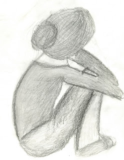
I chose this drawing because it shows the joint detail and also the sides of the wood. I know this drawing is not extreamly detailed but in my option it captures something that i like about my wood project, i dont really know what is was but just the overall feeling of the drawing is what i like.

This image shows the outside countour of the drawing and helps to show the form of the object i built. This is an abstracted version of my project but i like how it is not perfect and just shows my base form of the wood.

This show a close up of the practice pieces for a studio project and demonstrated how i focused on the continual wood grain. The wood grain was a huge part of my focus and helped pull the project together and make it a structure of its own instrad of a bunch of pieced bound together by dowles.


I have been working with experamenting with diffrent teckniques of drawing some highly detailed and some with just outline and shadows.  I have not suceeded in becoming some great artist but i am improving and will keep trying to challenge myself to find a drawing style that fits what i want to represent with my drawings.

Sketch Book- Things to Adopt


Both drawings are extreamly well done and they inspire me to try to use her shading teckniques and atempt to shade using strong justures instead of blending out the shading.

Sketch's of light thru bottles by Laura Kimmel

 
Sketch of a leaf by Lindsey Grace
This drawing of a leaf by lindsey helps to show me how to improve my contour drawings not just by focusing on the outside contour but also on the inside texture of the object.


Saturday, October 30, 2010

Light Project - Phase 2


At the beginning of this project i started out wanting to create something with a organic natural shape but over time and after working with the tools in the wood shop i realized i wanted to create a very straight and clean system. My first attempt i used a saw that created splinters and after talking to Tommy i thought i was focusing on the splintering of the wood. and them started to work on the joinery and found that it would work well if i used the idea of a square pole in circle holes and made the joints concentrate where the splinters happened most.


After my first model i felt like it wasn't important to focus on the splinters and decided to create extremely clean lines so the wood grain would be shown off better since i found wood that had darker grain.  And it was sorta a mistake but the half of a X created when i cut the side out made a detail that i liked so i left it.  then when i was putting the piece together i started to notice the grain of the wood was not continuous and if i was focusing on the grain then it needed to be so i remade the project.


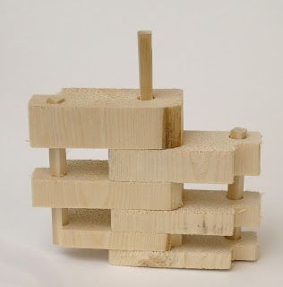
After i started to cut the wood i figured the little X that i had thought was interesting earlier distracted from the grain pattern so i did my best to make the cut exact so that would not happen, but i could not do it so the grad student in the wood shop taught me how to make my cut exact. Then i figured it would help my project read better if the pieces had a mathematical reason to their size progression and i tried increasing it by half, a forth, three fourths, until i just doubled  the size.  So i ended up with this final project that was really clean and rectangular and the grain on each side is continuous and the pieces also double in size from the top to the bottom.


After i had my project built i wondered if i stained the outside rods the darkest color in the wood grain if it would frame my work but it just ended up looking slightly off so i did not use the stain idea.