Saturday, October 30, 2010

Light Project - Phase 2


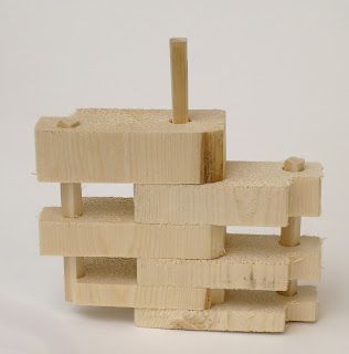
At the beginning of this project i started out wanting to create something with a organic natural shape but over time and after working with the tools in the wood shop i realized i wanted to create a very straight and clean system. My first attempt i used a saw that created splinters and after talking to Tommy i thought i was focusing on the splintering of the wood. and them started to work on the joinery and found that it would work well if i used the idea of a square pole in circle holes and made the joints concentrate where the splinters happened most.


After my first model i felt like it wasn't important to focus on the splinters and decided to create extremely clean lines so the wood grain would be shown off better since i found wood that had darker grain.  And it was sorta a mistake but the half of a X created when i cut the side out made a detail that i liked so i left it.  then when i was putting the piece together i started to notice the grain of the wood was not continuous and if i was focusing on the grain then it needed to be so i remade the project.


After i started to cut the wood i figured the little X that i had thought was interesting earlier distracted from the grain pattern so i did my best to make the cut exact so that would not happen, but i could not do it so the grad student in the wood shop taught me how to make my cut exact. Then i figured it would help my project read better if the pieces had a mathematical reason to their size progression and i tried increasing it by half, a forth, three fourths, until i just doubled  the size.  So i ended up with this final project that was really clean and rectangular and the grain on each side is continuous and the pieces also double in size from the top to the bottom.


After i had my project built i wondered if i stained the outside rods the darkest color in the wood grain if it would frame my work but it just ended up looking slightly off so i did not use the stain idea.


Monday, October 25, 2010

Tadao Ando- light artist

LIGHT...
 something we tend to overlook throughout our loves but some artist decide to use this light to create and highlight things around us. dictionary.com defines light as the state of being visible, exposed to view, or revealed to public notice or knowledge, this is evident in the art work of Tadao Ando.
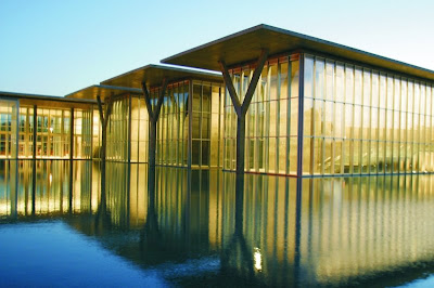
Modern Art Museum
at Fort Worth, Texas

Church of the Light,
in Osaka, Japan

Tadao Ando is a architect and light artist who was born in Osaka Japan, in 1941.  At a young age he started to experiment with creating things out of wood and this helped to influence his artistic style. At age 28 Ando opened his own studio and has been a visiting professor at Tokyo University, Yale, Harvard, and Columbia.  When ask about his designing style Ando said "walls are the most basic elements of architecture, and in all my works, light is an important factor. the primary reason is to create a place for the individual,  a zone for oneself within society." At first looking at his architecture you notice the large walls materiality which sets a limit for the design. However, the walls seem soft to touch and admit light.  Lastly the buildings surround the visitor with light and nothing else creating a feeling of emptiness. Ando's work involves the visitor in a almost mueseam like display of light art.


Henry Urbach Architecture Gallery
New York, New York

Similar to Ando's style  which emerses the viewer in the art architect Lebbeus Woods and artist Kiki Smith created the above piece which shows a overhead illumation that cast a subtle dark blue object floting in the center of the room.

Monday, October 18, 2010

Object A and B Pictorals


In this project my strengths were the measurements and the overall layout. My weaknesses were getting the angles and all the parallel lines right but after redoing object b i figured out the angles and parallel lines. I did choose to redo this project to improve my grade and figured out how to use multiple triangles to achieve the angles you need also i found out that if you work from left to right in a drawing your lines will match up better at the end and you wont have a bunch of lines that dont line up perfectly.

Selected Object Pictorls


Strengths in this project was figuring out the irregular shape of the bottle and then figuring out how to draft the shapes. My weaknesses were all the elipses on the top of the bottles. 

Wednesday, October 13, 2010

Selected Object Orthographics

This is the object i chose.


this was my original version but then modified the shape.

Architectural Lettering

Sunday, October 10, 2010

"I will love the light for it shows me the way, yet I will endure the darkness because it shows me the stars."

We just finished the first phase in our study of light and so far i have started to pay more attention to the effect light has on things but i have also noticed that its also the effect that the absence of light has on the world that creates the most intrest.  Light allows us to clearly see objects full illumanated but its not untill you add shadow to that same object that you start to see all the little deatails and variations in that object.


"It is not the form that dictates the color, but the color that brings out the form."

Lately i have been noticing all the color in the world around me and i'm inspired by that...color just brightens my day no matter what is going on, even tho i'm a strong believer in the quote that says "paint some one in color you paint their clothes but if you paint someone im black and white you paint their soul". However i do LOVE COLOR and i believe that it has an effect on people that nothing else can also i believe it highlights objects around us and draws our eye to things that if it was white would have just blended in.

....so here's a few pictures i've took this weekend or color.


Monday, October 4, 2010

Seeing the Light- Phase One

 Here are a few pictures that inspired my Light Project.


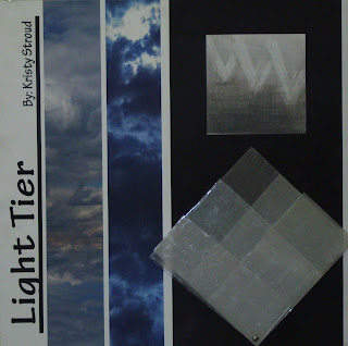
After i took all of these pictures i then photoshopped then into two diffrent pictures and then combined them.  Combining the two sets of pictures contract the light coming thru the layers of clouds and the time of day shows the light affect.

Picture on the left was taken at 9 am and the
 picture on the left was taken at 3 pm that same day.

This was my final presentation board for my light phenomenon of light coming through layers of clouds at different times of the day. To make my board look more uniform i decided to use photo shop an illustrator to create the look of a finalized board.

Sunday, October 3, 2010

Rivers and Tides

The documentary Rivers and Tides is about Andy Goldsworthy and how he uses the nature around him to create art that looks like it was created by nature itself instead of human hands.Goldsworthy's art has a extreamly short life and after nature takes it coarse most the time only photography lives on to show his work to the world.  This documentary helped teach me to look at my enviroment in a diffrent way where everything could be looked at in a diffrent way and where everything is art.